


OneUI Widgets
JustNewDesigns
I installed OneUI Widgets because I wanted my Android home screen to feel more like a carefully designed dashboard and less like a collection of unrelated shortcuts. From JustNewDesigns, this personalization app focuses on widgets inspired by Samsung’s One UI visual language, with a large selection aimed at people who care about spacing, rounded shapes, readable information, and a consistent look. My first impression was that it is less about adding one spectacular tool and more about giving the whole home screen a shared visual rhythm.
That distinction matters. A normal widget app may give you a clock, weather panel, calendar block, or battery indicator and leave you to combine them. Here, the attraction is the relationship between those elements. When the widgets sit together, the screen can look intentional rather than assembled from several unrelated apps. I found that especially useful after changing wallpaper or launcher layout, because a few coordinated widgets can make a basic setup feel much more finished.
The app is listed in the Personalization category, carries an Everyone age rating, and costs $0.99. It also offers in-app purchases ranging from $0.99 to $13.99 per item, so I would check the available purchase choices before planning a complete setup around every design. Its current version is 2.1.004 and it requires Android 12 or later. That operating-system requirement is important: this is not a universal option for older phones, even if the device still runs other widget applications comfortably.
From an Untidy Home Screen to a Usable One
The starting condition: too much information, not enough structure
My realistic starting point was a home screen that worked but did not feel calm. I had a clock in one style, a calendar in another, and a few shortcuts occupying space without a clear hierarchy. Nothing was technically wrong, yet every glance required more visual effort than it should. This is the kind of situation where a widget collection can be more valuable than a single decorative clock.
I approached OneUI Widgets as a layout tool rather than a wallpaper accessory. Before placing anything, I decided what I actually needed to see without opening an app: the time, the date, upcoming commitments, and a small amount of at-a-glance information. That preparation made a noticeable difference. If you simply add widgets until the screen looks full, even a polished collection can become cluttered.
Related News

Why WhatsApp Messenger Still Makes Everyday Communication Feel Easy

Jurassic World: The Game Is the Better Dino Tycoon for Strategic Players

Threads in Real Life: Who Should Join, Lurk, or Leave

How SHEIN Turned Shopping Into an Endless Content Feed

How to Make Fortnite Feel Smarter on Mobile

Should You Switch to Microsoft Outlook on Mobile?
The One UI influence is most useful for users who prefer a soft, organized Android appearance. The visual direction suits modern Samsung-style layouts, but you do not need a Samsung phone to appreciate it. On another Android device, the widgets can still provide a more unified appearance than mixing the default clock, calendar, and weather tools supplied by different developers.
Choosing a layout before choosing individual widgets
I recommend starting with the shape of the screen rather than browsing randomly. Decide whether the top area should be reserved for a large time display, whether the middle should hold information you check repeatedly, and whether the bottom should remain open for app icons. This sounds simple, but it prevents a common problem: selecting attractive widgets that compete for the same space.
A practical arrangement is to use one visually dominant widget and keep supporting elements quieter. For example, a larger time-and-date area can establish the main focus, while smaller information blocks sit below it. The benefit is not just appearance. A consistent hierarchy makes the screen faster to scan when you are leaving home, checking a meeting time, or deciding whether you need to open the calendar.
Gallery
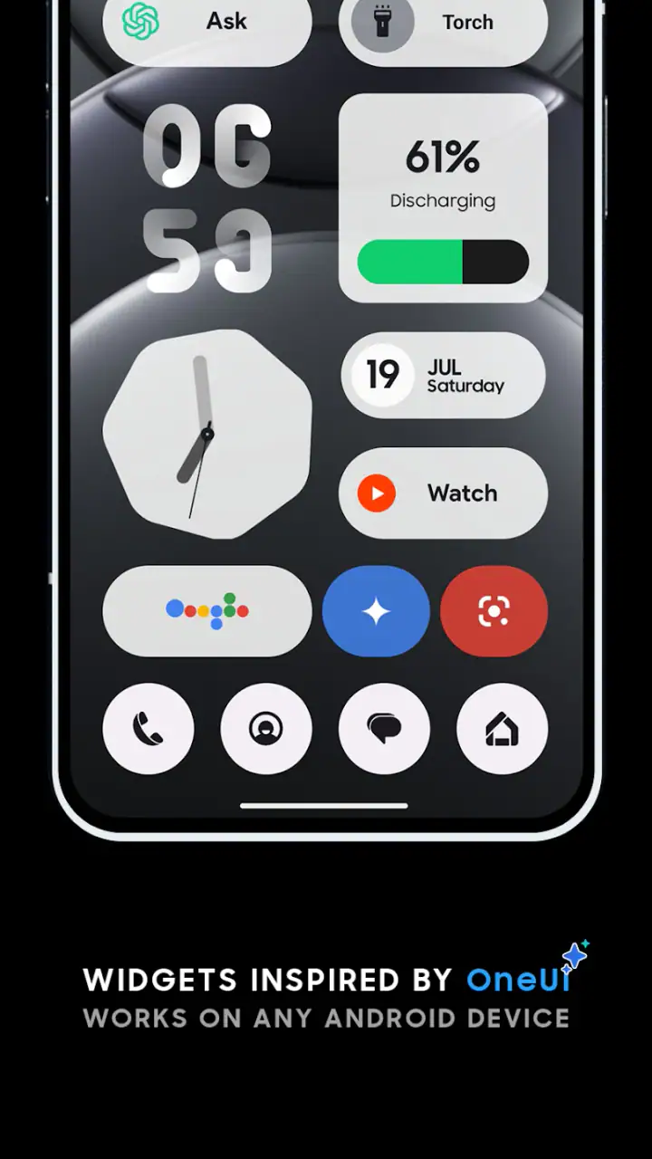
One of my more useful discoveries was that widget size should follow reading distance, not just available grid space. A compact widget may look elegant in the picker but become frustrating when its text is too small for a quick glance. Conversely, a large widget can make the screen feel empty if it contains very little information. I would test the smallest comfortable size first, then expand only when the content genuinely needs it.
The step-by-step flow: browse, place, adjust, and live with it
The first stage is browsing the collection with a specific purpose. Rather than treating the selection as a gallery, I looked for matching roles: a primary time display, a date-focused element, and supporting information that would not distract from the main area. The store summary describes more than 300 crafted widgets, which gives the app breadth, but breadth can also create decision fatigue. A short list of requirements keeps the process manageable.
After choosing a widget, I placed it on an empty area of the home screen and watched how the launcher handled the available grid. This step is more important than it sounds because the final result depends on the launcher’s spacing, icon arrangement, and resizing behavior. The widget itself may be carefully designed, while the surrounding home screen still makes it look cramped. I found it better to move icons temporarily than to judge the design in a crowded layout.
Next, I adjusted the size and position in small increments. A widget that looks balanced at the top may feel too heavy once app icons are added beneath it. I also checked the screen at the times I normally use my phone rather than judging it only in the setup moment. Morning glare, one-handed use, and quick checks while walking all expose problems that are easy to miss when customizing at a desk.
The best workflow is to make one change, use the phone normally, and then decide whether another change is needed. This avoids endlessly rebuilding the screen. I would also take a quick mental note of which information is genuinely useful. A beautiful widget that I never read is still taking space away from something more practical.
Handoffs between the widget app, launcher, and everyday apps
The most important handoff is not inside OneUI Widgets itself; it is between the widget and the launcher. The app supplies the visual component, but the launcher determines how it sits among icons and other panels. That means the same widget can feel polished on one home-screen setup and awkward on another. Users who enjoy customizing launchers will probably appreciate this flexibility, while people expecting a completely automatic transformation may find the process more hands-on.
There is also a handoff between what the widget shows and the application that owns the underlying information. A date or schedule widget is only useful if the information remains current and readable in the context of the home screen. I treated each widget as a doorway to information, not a replacement for the full calendar or other source app. That mindset prevents disappointment when a compact panel cannot offer every detail available after opening the main application.
This is where OneUI Widgets compares favorably with a collection of unrelated alternatives. Default widgets are often perfectly functional, but their visual language may vary from one system app to another. Third-party customization tools may offer deeper control over typography, colors, and data sources, yet they can require more time to configure. OneUI Widgets sits between those extremes: more cohesive than a random collection, but less like an unlimited design editor.
The developer, JustNewDesigns, clearly puts emphasis on visual consistency. That is helpful when you want a screen that looks finished quickly. It is less helpful if your goal is to reproduce a very specific personal design that depends on unusual data, elaborate automation, or exact control over every element. In that case, a more technical widget builder may be the better choice, even if it takes longer to learn.
How I would use it in an everyday scenario
Imagine leaving work with several things to check: the current time, the next appointment, and whether there is enough room in the evening to run an errand. Instead of opening separate applications, I would use the home screen as a first checkpoint. The large, readable element answers the time question immediately, while a supporting widget gives the schedule context. If the layout is restrained, I can make that decision without navigating through several screens.
Another useful scenario is a shared visual reset after changing phones. Rather than rebuilding a home screen from unrelated defaults, I would place a small group of matching widgets first and then arrange the most-used icons around them. This makes the new device feel familiar sooner. It is a subtle benefit, but personalization is often about reducing friction during ordinary moments rather than creating a dramatic effect.
I also found value in using the app for a secondary home screen rather than the main one. The primary screen can stay focused on communication and frequently opened tools, while a second page carries the larger information panels. This is a good compromise for users who like attractive layouts but do not want a decorative widget consuming the most convenient space.
What the finished result feels like
When the widgets are chosen with restraint, the result is a calmer home screen with a clear visual identity. The One UI-inspired treatment gives rounded, approachable structure without making the display feel like a poster. I particularly liked the way a coordinated group can make ordinary information feel easier to scan, even though the underlying phone functions have not changed.
The rating of 4.6 from around 3.6 thousand ratings suggests that the app has connected with a meaningful group of users, and its install count is over 50 thousand. I would not treat those figures as a guarantee that every device will look identical, because launcher layouts and display sizes vary. Still, they indicate that this is more than an experimental theme with a tiny audience.
The strongest outcome is visual coherence. If you already like One UI’s rounded cards, generous spacing, and soft presentation, the collection can save you from hunting through several unrelated widget packages. It is also a sensible choice for someone who wants to improve a phone’s appearance without learning a full customization system.
There is a practical trade-off, though. A widget is most successful when it helps you decide or act quickly. If you fill the screen with several attractive panels, the result can become slower to read than a simpler arrangement. My advice is to begin with one anchor widget and one supporting widget, then use the phone for a day before adding more. That workflow preserves the visual benefit without turning personalization into maintenance.
Where the flow breaks
The first breaking point is compatibility. Android 12 is the minimum operating-system requirement, so anyone using an older version should skip this app rather than assume a workaround will provide the same experience. The requirement also means that a phone capable of running basic widgets may still be excluded here.
The second issue is cost structure. The app has a $0.99 price, while additional in-app items can range from $0.99 to $13.99. That does not automatically make it poor value, especially for users who will keep the same home-screen style for a long time, but it does mean the total cost can depend on how much of the collection you want. I would start with the included experience and only pay for extras that solve a clear layout need.
Another point of friction is the difference between visual polish and deep customization. If you want to build widgets around highly specific information, unusual layouts, or complex personal workflows, a dedicated advanced widget editor may offer more control. OneUI Widgets is better suited to selecting a finished design and integrating it into your screen than to constructing every visual detail yourself.
Launcher behavior can also interrupt the smoothness of the process. Resizing, grid limits, and the way icons occupy space are outside the widget collection’s visual concept. If a design looks cramped, the solution may be changing the launcher grid or moving icons rather than blaming the widget. Users who prefer never to adjust their home screen may find this setup work unnecessary.
I would also advise against choosing it solely because you want a functional replacement for every default tool. The collection’s main strength is presentation and cohesion. If your priority is maximum data density, specialized automation, or the deepest possible integration with a particular service, another category of app may suit you better. A plain default widget can be the smarter choice when speed and familiarity matter more than appearance.
Who should install it, and who should pass?
I would recommend OneUI Widgets to Android users who enjoy a tidy home screen, like Samsung-inspired design, and want several widgets to look as though they belong together. It is especially appealing after a phone upgrade, a launcher change, or a wallpaper refresh, when the default layout feels unfinished. People who want a quick visual improvement without learning a complicated editor are likely to get the most from it.
I would be more cautious if you rarely use widgets, prefer an almost empty home screen, or need precise control over data and behavior. In those cases, a single default clock or calendar widget may be enough. The app is also a poor fit for devices below Android 12 and for users who dislike paid add-ons after the initial purchase.
My final advice is to plan the screen before opening the widget picker. Choose the information you check most, reserve the clearest space for it, and treat the rest of the collection as optional support. That approach reveals the app’s real strength: it turns a group of ordinary home-screen elements into one consistent visual system, provided you do not mistake having many choices for needing to use them all.
After working through the full process, I see OneUI Widgets as a focused personalization purchase rather than an all-purpose home-screen replacement. It delivers the most value when the desired outcome is a calm, coordinated Android layout with a One UI flavor. The price and extra purchase options deserve attention, and the experience still depends on the launcher and device version, but the collection makes a convincing case for users who care about the small visual details they see every time they unlock their phone.
FAQs for OneUI Widgets
What are OneUI Widgets?
OneUI Widgets are customizable home-screen widgets designed to match Samsung’s One UI visual style. They can provide quick access to information and shortcuts such as weather, calendars, clocks, battery details, notes, or other supported functions. Depending on the version and the device, the exact widget collection may vary, so users should review the app description and available previews before downloading.
Are OneUI Widgets compatible with every Android phone?
Compatibility can vary considerably between devices. OneUI Widgets are generally intended for Android phones, particularly Samsung Galaxy models using a recent version of One UI, but some features may also work on phones from other manufacturers. Android version, launcher support, screen size, and the app’s current release all affect performance. Check the Google Play listing and your device requirements first.
How do I add and customize OneUI Widgets on my home screen?
After installing the app, press and hold an empty area of your Android home screen, select the Widgets option, and look for the available OneUI Widgets. Drag a widget to the desired location, then adjust its size, style, color, transparency, or information sources if those options are provided. Some launchers may use slightly different steps or limit certain customization controls.
Do OneUI Widgets require special permissions or affect battery life?
Some widgets may request permissions to display accurate information, such as location for weather, calendar access for events, or notification access for certain indicators. You can review and manage these permissions in Android settings. Battery usage is normally modest, but widgets that refresh frequently or use location and background data can consume more power, especially when several are active.
Is OneUI Widgets free to download, and are there in-app purchases?
The download model may depend on the specific OneUI Widgets version and publisher. Some editions are free with optional premium themes, widget packs, or customization tools, while others may include advertising or require a purchase for the complete collection. Before installing, check the store page for pricing, subscriptions, advertisements, supported devices, and the developer’s privacy information.
Pros
- Clean Samsung-style design that blends naturally with One UI home screens.
- Offers useful at-a-glance information without opening full applications.
- Widget layouts are generally easy to place
- resize
- and customize.
- Can improve access to frequently used tools and shortcuts.
- Fits well with Samsung devices and the broader Galaxy visual experience.
Cons
- Some widgets may require permissions that privacy-conscious users dislike.
- Compatibility can vary across Android versions and Samsung phone models.
- Certain features may be limited compared with Samsung’s built-in widgets.
- Widgets can consume additional battery when frequently refreshing information.
- The selection may feel less useful if you do not already use Samsung services.


